AkzoNobel brings a breath of fresh air to homes with Colour of the Year 2022
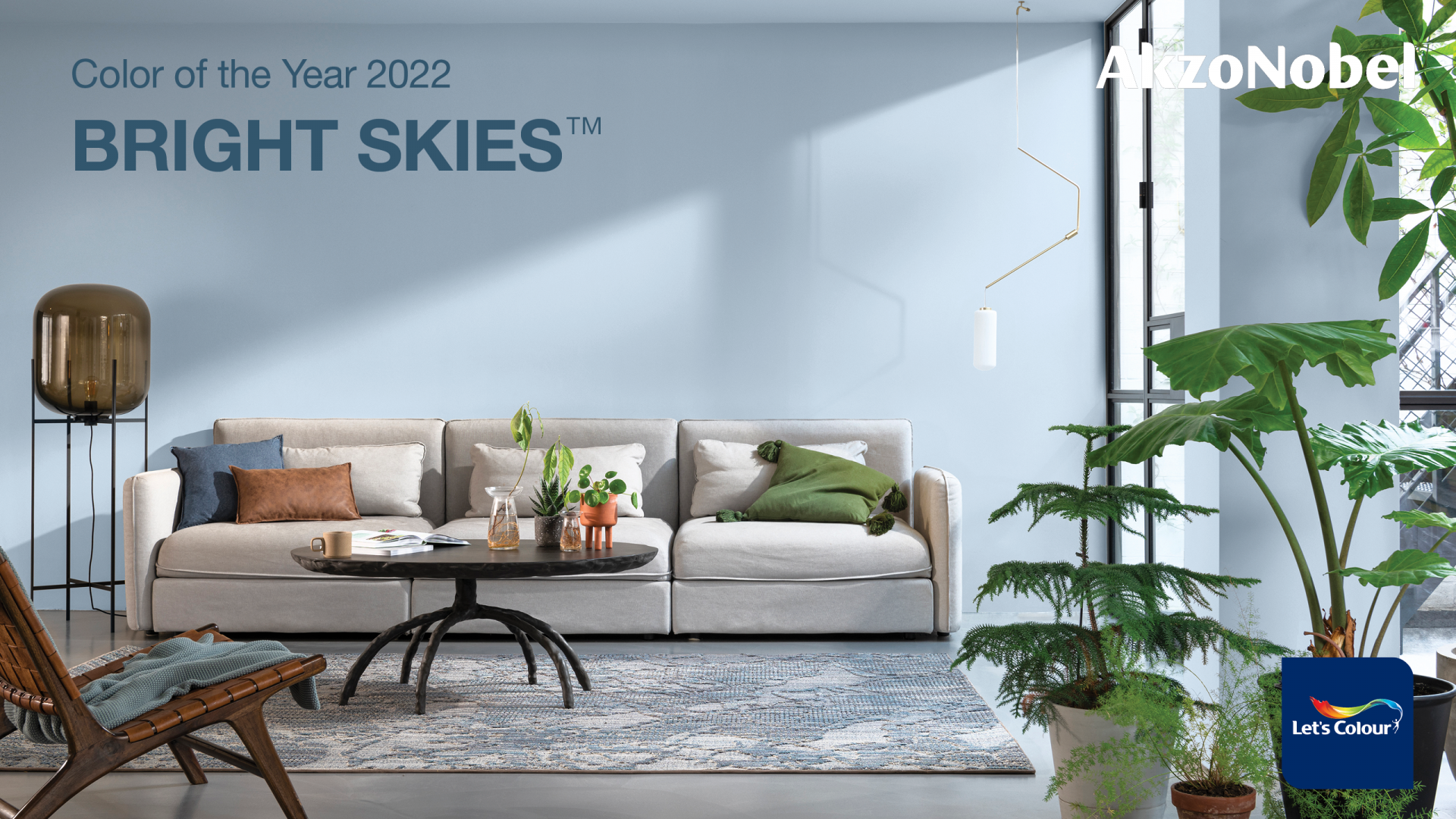 |
| The airy, light blue was chosen because it perfectly captures the optimism and desire for a fresh start |
Bright Skies reflects the limitless skies, giving people the space to redefine the role of homes, nature, and arts in life. As described by AkzoNobel’s experts at the company’s Global Aesthetic Centre who research global trends, insights, and consumer behaviour, Bright Skies was chosen because it perfectly captures the optimism and desire for a fresh start.
The 19th Colour of the Year was also recognised for its flexibility, especially after a spell of feeling shut in and at a time when people are navigating hybrid workspaces and adapting to new conditions of travel.
| The 19th Colour of the Year was also recognised for its flexibility, especially after a spell of feeling shut in and at a time when people are navigating hybrid workspaces and adapting to new conditions of travel. |
“As consumers look to express themselves and transform their spaces, our aim as colour experts is to inspire their confidence. This year, vibrant colours and light tones are re-emerging – a reflection, perhaps of our need for positivity and a fresh approach. Bright Skies will help us embrace new ideas and shape a new future,” said Heleen van Gent, creative director of AkzoNobel’s Global Aesthetic Centre.
“We realise clear trends that more than ever, people are rethinking the way of building space, putting nature first. They are all about the breath of fresh air which can be brought back into homes with Bright Skies on the walls,” highlighted Oscar Wezenbeek, managing director for Southeast and South Asia at AkzoNobel Decorative Paints.
To show how Bright Skies works with a host of other shades, the AkzoNobel Aesthetic Centre has designed four decorative colour palettes inspired by the changing role of the home: Workshop colours, greenhouse colours, studio colours, and salon colours. These palettes make it easy to choose and combine an array of soft neutrals and joyful hues that can be used to define zones in multipurpose spaces, bringing a sense of nature indoors and creating a soothing atmosphere or encourage a sense of unity.
These trends are also translated into other sectors, such as automotive and speciality coatings, coil and extrusion coatings, powder coatings, and wood coatings, based on extensive colour and material research and market analysis. Tailor-made colour palettes are developed for the aerospace, automotive, consumer electronics, metal furniture, domestic appliances, cabinetry, flooring, building products, and architecture markets.
“After a long period of feeling trapped inside, people want open air and a fresh approach to everything. As various events over the past two years have changed many aspects of life, we are reassessing what matters: family, friends, home, and the world around us,” shared MyLan Nguyen, general director of AkzoNobel Decorative Paints Vietnam. “As we are pioneering a world of possibilities to bring essential colour to industries and consumers, we introduce Bright Skies with a hope to help customers get revitalised and enjoy the freedom with new ideas.”
What the stars mean:
★ Poor ★ ★ Promising ★★★ Good ★★★★ Very good ★★★★★ Exceptional
 Tag:
Tag:
Related Contents
Latest News
More News
- 'Green passport' key for Vietnamese food to reach global markets (April 10, 2026 | 19:18)
- FV and Metfone launch Vietnam-Cambodia health corridor to ease cross-border care (April 10, 2026 | 13:00)
- World Bank forecasts Vietnam GDP growth of 6.3 per cent (April 10, 2026 | 12:17)
- Vietnam enhances SME ecosystem through digital and green transition training (April 10, 2026 | 12:09)
- Vietnam-Japan ties deepen as Tokyo expands skilled labour access (April 09, 2026 | 10:00)
- Healthcare sector accelerates administrative reform and digital transformation (April 08, 2026 | 23:47)
- Ho Chi Minh City urban cooperation set with French businesses (April 08, 2026 | 10:57)
- US business delegation heads to Vietnam to foster cooperation (April 08, 2026 | 10:47)
- Vietnam announces national strategy for innovative startups (April 08, 2026 | 10:45)
- Vietnam amends measurement rules (April 08, 2026 | 10:29)








 Mobile Version