Tranquil Dawn as AkzoNobel Colour of 2020: Give your home a human touch
 |
| AkzoNobel held the ceremony to announce the 2020 Colour of the Year |
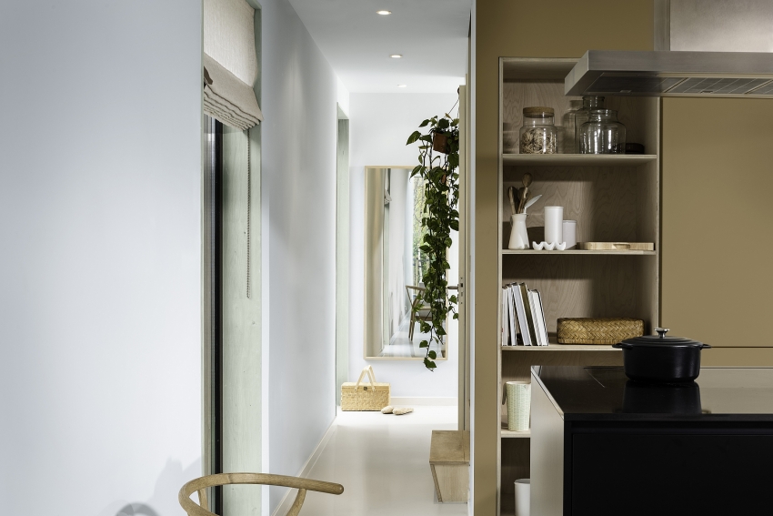
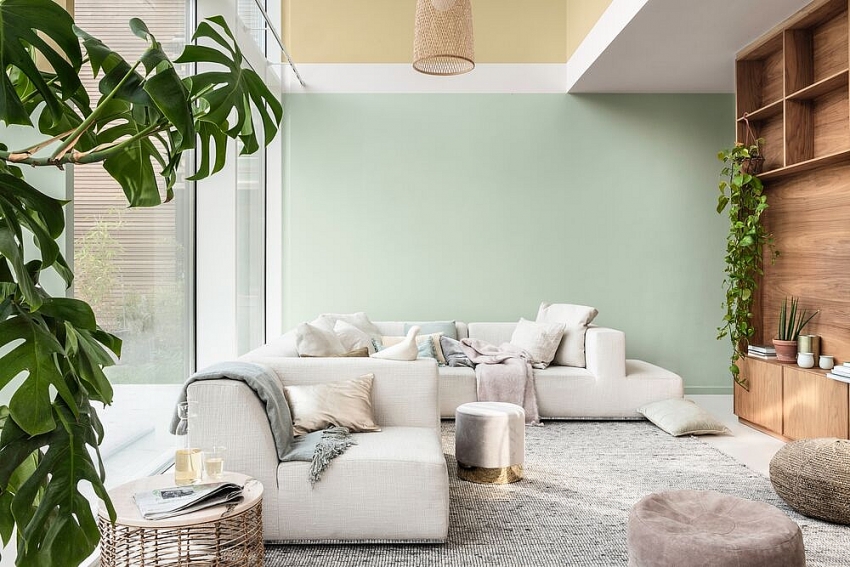
Inspired by the colours of dawn horizon, Tranquil Dawn is a delicate, fluid shade somewhere between green, blue, and grey. It was designed to capture the essence of what makes us “human” as the dawn of a new decade arrives. According to expert research into global trends, insight and consumer behaviour, this colour also conveys calm and stability, and reflects the widespread desire for a more meaningful existence.
"By transforming key global trends into Colour of the Year, this year, Tranquil Dawn will continue to bring our customers absolute confidence to choose paint for their sweet home," said Heleen van Gent, head of AkzoNobel’s Global Aesthetic Centre. “This colour is reminiscent of a bright morning sky and encapsulates our desire to treasure our most human qualities, which we’ll need in the new decade we are entering. It’s an exciting and inspiring way for us to share our passion for paint with the world,” said Heleen van Gent.
AkzoNobel continually invests in global colour research as part of their commitment to drive paint expertise forward. Trend research is a vital part of identifying the Colour of the Year and it plays a big role in helping AkzoNobel understand customers' needs and allowing them to devise paint to match with that.
 |
AkzoNobel colours including 2020’s new colour palettes began their journey at the AkzoNobel Global Aesthetic Center in Amsterdam. In the last 17 years, this has been AkzoNobel’s studio for trend analysis, colour design, and art direction. Each year, leading design professionals from all over the world are invited to come together to capture the mood of the moment, which is then translated into the annual colour palettes.
Oscar Wezenbeek, managing director at AkzoNobel Decorative Paints, South East & South Asia stated: “Colour is the core of our organisation and we understand the importance of their tones and shades and how they enhance the world around us. In 2020, light and clarity are needed more than ever. People are keen to examine their values and bring new meaning to everyday existence. In an increasingly digitised, superficial world, our global trend research suggests that people are experiencing a desire for positive real-world connections and relationships. Therefore, we bring to our customers Tranquil Dawn – the colour to give your home ‘The Human Touch',”
 |
In 2020, the choice of Tranquil Dawn will inspire four beautiful versatile colour palettes. Divided into separate themes, they are known as The Care Palette, The Play Palette, The Meaning Palette, and The Creativity Palette. With the breadth of the four palettes, Tranquil Dawn allows consumers to use it in a way that reflects who they are, how they want to feel, and how they want to live. Beyond home and decorative paints, the same palettes can be applied to other markets such as wood, furniture, consumer electronics, and automotive.
Pamela Phua, general director of AkzoNobel Paints Vietnam, said, “Colours can transform homes in different ways, giving us a great experience in life. AkzoNobel is proud to be the market leader to forecast the colour trend. By introducing The Colour of the Year 2020, we share the freshest moment of the early morning with our valued customers, which helps them get balance in a digital world, give them a happy and healthy home for connection, and unique better feelings and inspiring ideas.”
What the stars mean:
★ Poor ★ ★ Promising ★★★ Good ★★★★ Very good ★★★★★ Exceptional
Related Contents
Latest News
More News
- ‘Blue ocean’ an opportunity or a trap for sellers in 2026? (April 29, 2026 | 18:32)
- Vietjet's 2026 AGM highlights strong 2025 results (April 27, 2026 | 18:00)
- GS E&C, FPT partner on data centre and smart city solutions (April 25, 2026 | 21:20)
- AI and semiconductors drive new wave of Vietnam-South Korea business ties (April 24, 2026 | 14:57)
- Thanh Nam Group moves into coffee export market (April 24, 2026 | 13:00)
- Hyundai Rotem to supply driverless trains for Ho Chi Minh City metro (April 24, 2026 | 12:26)
- Vietnam's auto sector to benefit from Hyundai, KOICA training deal (April 24, 2026 | 12:21)
- Green SM extends lead in Vietnam's ride-hailing market to over 54 per cent (April 24, 2026 | 10:29)
- AMRO notes Vietnam's economic resilience despite global uncertainties (April 24, 2026 | 10:06)
- Dien May Xanh posts over $40,000 profit per hour in Q1 (April 23, 2026 | 17:39)

 Tag:
Tag:


 Mobile Version