Dulux embraces life with “Spiced Honey” as 2019 Colour of the Year
 |
| Dulux's choice of Spiced Honey fits the worldwide optimism discovered by its researchers |
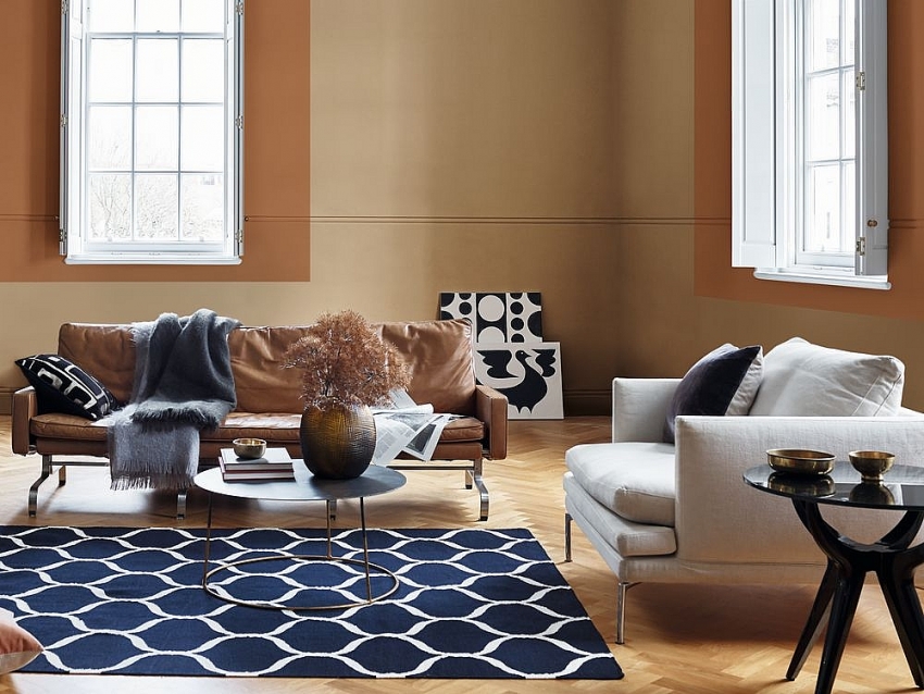
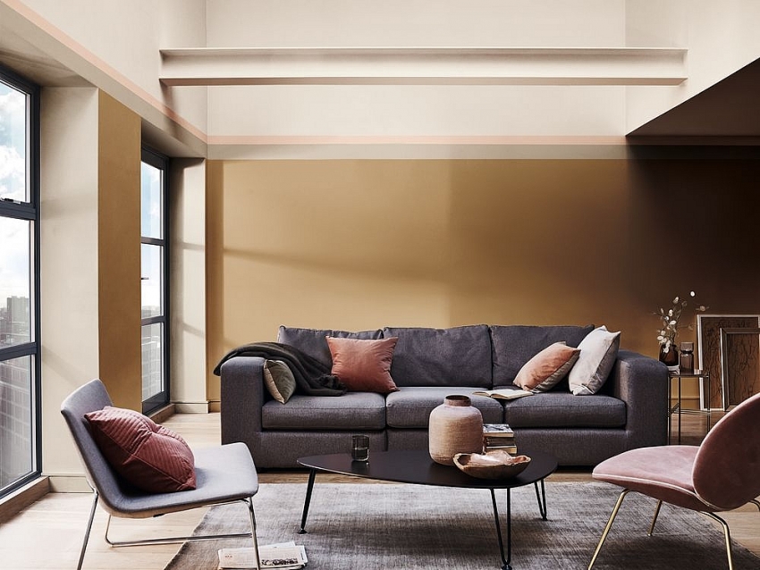
Capturing this year’s theme, “let the light in,” the warm amber tone is versatile and contemporary, and complements a wide variety of life and interior styles. It expresses the new sense of optimism felt throughout AkzoNobel’s global trend research.
“Our colours begin their journey at the Global Aesthetic Centre, which has been responsible for trend analysis, colour research, colour design, and art direction at AkzoNobel for over 25 years,” explained Heleen van Gent, creative director of AkzoNobel’s Global Aesthetic Centre. “Today’s reveal of Spiced Honey is another milestone in empowering our consumers worldwide to choose paint colours with absolute confidence.”
Top design professionals from all over the world are invited each year to come together to capture the mood of the moment. “Last year, many of us were left unsettled by global events, so we closed our doors to retreat and regroup,” continued Heleen van Gent. “Now we feel ready to open our windows and let the light in.”
“Our trend research shows that people around the world are experiencing a renewed sense of energy, optimism, and purpose. We want to reach out, engage with others and to make things better. Spiced Honey reflects those desires – it is a colour that can be calming or nourishing, stimulating and energising, depending on the light and colours surrounding it,” said Oscar Wezenbeek, managing director of AkzoNobel Decorative Paints Southeast & South Asia, and Middle East.
 |
Now in its 16th year, the Dulux Colour of the Year is selected annually to help consumers make colour and design choices with more confidence providing support on all steps from inspiration through visualisation, product choice, and application. Consumers can use various tools including wet testers and innovative digital solution like Visualiser.
“At AkzoNobel, we work year-round to identify the latest colour trends and translate these into relevant colour palettes and products that meet our customers’ expectations – in every circumstance,” added David Menko, chief marketing officer of AkzoNobel’s Decorative Paints business. “Coupled with the right digital tools, we take great pride in enabling our consumer to make confident colour choices.”
Under the umbrella of Colour of the Year, Spiced Honey inspires four harmonious colour palettes.
While Colour of the Year is of major significance for the decorative paints market, the insight that is gathered is also highly relevant to the company’s coatings portfolio. For example, the Specialty Coatings business translates the annual trend research for customers in the consumer electronics and automotive markets. Meanwhile, colour stylists at Wood Coatings use the information to offer on-trend colour selections for product developers and designers in major markets such as furniture, cabinetry, flooring, and building products.
What the stars mean:
★ Poor ★ ★ Promising ★★★ Good ★★★★ Very good ★★★★★ Exceptional
Related Contents
Latest News
More News
- AI and semiconductors drive new wave of Vietnam-South Korea business ties (April 24, 2026 | 14:57)
- Thanh Nam Group moves into coffee export market (April 24, 2026 | 13:00)
- Hyundai Rotem to supply driverless trains for Ho Chi Minh City metro (April 24, 2026 | 12:26)
- Vietnam's auto sector to benefit from Hyundai, KOICA training deal (April 24, 2026 | 12:21)
- Green SM extends lead in Vietnam's ride-hailing market to over 54 per cent (April 24, 2026 | 10:29)
- AMRO notes Vietnam's economic resilience despite global uncertainties (April 24, 2026 | 10:06)
- Dien May Xanh posts over $40,000 profit per hour in Q1 (April 23, 2026 | 17:39)
- VinFast deliveres over 58,000 EVs globally in Q1 (April 23, 2026 | 17:24)
- Jadestone Energy signs gas sales agreement in Vietnam (April 21, 2026 | 17:20)
- Vietnam’s small businesses top Asia-Pacific growth rankings, survey says (April 21, 2026 | 11:55)

 Tag:
Tag:


 Mobile Version